menu
by Christopher Payne - Football Brand Designer
When I received the first draft of this blog post, the project was highly confidential. No one could know about the club's name or brand identity until it was announced by the stake-holders. Extreme secrecy is never a problem for me, and it was an honour to be brought on board at this tentative stage.
Chris is an exceptional designer, but he doesn't have the same expertise when it comes to writing. Even so, he loves to write about his projects, and his blog posts are a great tool for attracting new clients, so it is important the writing has a professional edge to it.
His first draft required a classic tidy-up edit. This meant fixing errors, trimming unnecessary detail, and helping the writing flow and impress.
Let's see how I got on.
case study
helping a brand designer explain their process
branding blog post edit
Santa Barbara Sky


this page is being redeveloped
original opening
At this point in my football + design journey, I have had the good fortune to work closely with many successful football club owners, and help them bring their football club branding vision to life. It has been a true joy. Each football club owner is different in their own way, and I feel that I have learned something new from each and every football owner and director that I’ve worked with - so when the opportunity to work with Peter Moore (the much loved former CEO at Liverpool FC) came around - I know it was an opportunity I could not miss out on.
What needs fixing? The opening features small errors, like using a plus sign where it's not needed, and the repetition of the word 'owner' feels a little clunky. These needed tidying up, but as the blog opens by highlighting Peter Moore's role, it felt necessary to add context and build on Chris's understandable excitement.
edited opening
At this point in my football and design journey, I’ve helped a number of football club owners bring their creative visions to life. They were all a joy to work with and each one taught me something new about the business. With that in mind, I wasn’t going to pass up the opportunity to work with Peter Moore. A Liverpool native and current Santa Barbara resident, Peter has sat at the top tables of Sega, Microsoft, and Electronic Arts. If you were wondering how you could possibly top that, in 2017 he was named CEO of his hometown club, Liverpool FC. During his three-year tenure, the Reds won the UEFA Champions League, the FIFA Club World Cup, and the Premier League. What a CV!
What's changed? I wouldn't usually add to an opening paragraph as brevity is often the best course, but Chris was name-checking Peter Moore without really bigging up his CV. I researched Peter and added information that seemed relevant.

Like my work on this blog post and need something similar? Tap the coffee cup to get in touch.
I am extremely proud of the crest and brand that we have created for Santa Barbara’s first professional soccer team.
The design is strong and powerful, stylish and unique. It is a brand that was designed to stand out in the football industry, whilst ‘feeling like Santa Barbara’.
The crest has a unique look. Its shape is inspired by the curvature of the arched windows and doorways seen in Santa Barbara’s architecture. The colours; terra-cotta and navy blue reference the tiled rooftops and mesmerising night sky. And the saint - Santa Barbara sits in the middle of the crest, looking the viewer in the eye, and drawing the viewer in.
I am extremely excited to see this crest and brand worn by passionate local supporters and players who will represent Santa Barbara.
original conclusion
What needs fixing? It is tempting to summarise the entire post/project in the final paragraph but your reader already knows this information. Instead, it is better to end on a positive note - in this case, one that envisages the bright future of the brand. With Chris's approval, I edited and slightly rewrote the final paragraph.
I am extremely proud of the crest and brand we’ve created for this exciting new club. The design is stylish and unique and will speak positively for Santa Barbara wherever it travels.
It will be such a thrill to see the brand come to life when the club kicks its first ball in the USL. That occasion will be a fantastic excuse for my third trip to Santa Barbara. Although, for once, I won’t be there for the beaches and the architecture, I’ll be there for the football; standing side-by-side with passionate Santa Barbarans singing their hearts out in navy blue and terracotta.
edited + rewritten conclusion
What needs fixing? By removing the paragraph that summarises the project, the ending is much punchier. It also leaves the reader with a visual image of the future of the club and brand, emphasising Chris's passion for the project as a whole. If you would like to read the finished blog post, follow the link below.

*Please note, the article's sub-headings were written by the author and have not been edited.
design talk edit
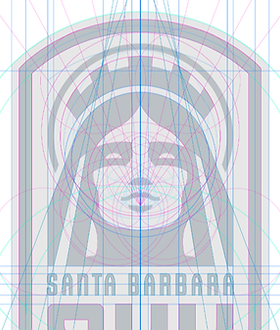
My rough sketch acts as a guideline for the intricate digitisation process. Using Adobe Illustrator, I set out acutely measured lines and intersecting circles to define the placement of my design elements. Working to this degree of accuracy ensures the resulting crest has a sleek and professional look.
As I tweak and improve the design, I focus on how the different spaces and shapes relate to one another. My designer’s eye also pays minute attention to the crest’s visual hierarchy. Finding the right balance requires great patience, but it’s vital to ensure the design is pixel perfect.
What's changed? It's a subtle tweak, but the language has been altered. While technical terms like 'visual hierarchy' remain, I have removed phrases like 'design architecture' to give the description a more down-to-earth feel. Sentence structure has also been tweaked to help the writing flow.
Using the rough sketch as a guideline for the digitization of the design, I built out the design using Adobe Illustrator. To ensure that the design has a solid structure and a high quality look, I used acutely angled lines and intersecting circles to guide the build of the designs. During this design development stage, I pay close attention to how the shapes are formed and how the different shapes relate to each other. I use my designer’s eye to assess the balance and hierarchy of the designs architecture and structure. It is a long process, but vital to ensure that the football club's crest is pixel perfect.
talking about design
What needs fixing? When you're an authority on a subject, it can be difficult to talk about it in terms that non-experts can absorb. While you don't want to talk down to your audience you also don't want to bamboozle them with industry terms. It's a tricky balance.